#3 – Facebook 20% Text Rule Has Changed … And Not For The Better
Why I’m Covering The New Facebook 20% Text Rule Today
In order to protect the user experience, Facebook has enforced a 20% text rule. Any ad image with more than 20% text was rejected. As of June 8, 2016, that “rule” no longer exists. Should you rejoice? Is this going to make your life easier? Not so fast. Turns out, from the advertisers perspective, this makes things worse, not better. In this episode of Facebook Live with Kim Snider, I’ll tell you why …
Time Stamped Index Of Video
0:27 – Quick introduction for those who don’t know Kim
1:01 – The “old” Facebook 20% Text Rule
2:44 – Facebook has done away with the “old” Facebook 20% Text Rule effective June 8, 2016
3:01 – Why we were better off with the old 20% text rule than we are now
3:18 – Facebook now groups images in four categories: OK, low, medium & high
3:28 – Link to Facebook’s examples of the four categories
4:00 – Problem #1 is categorization is subjective where it used to be black and white
4:17 – Problem #2 – ads that were OK under old guidelines are now considered low, not OK
4:37 – Facebook’s OK category onlu includes images with “little or no text”
5:27 – Facebook says reach “may be slightly lower” for ads that are in low text bucket
5:45 – My ad with low text image was dead on arrival … not slightly less reach .. dead!
5:53 – that image was basically the equivalent of the old 20% text images
7:19 – Link to Facebook’s new image overlay tool
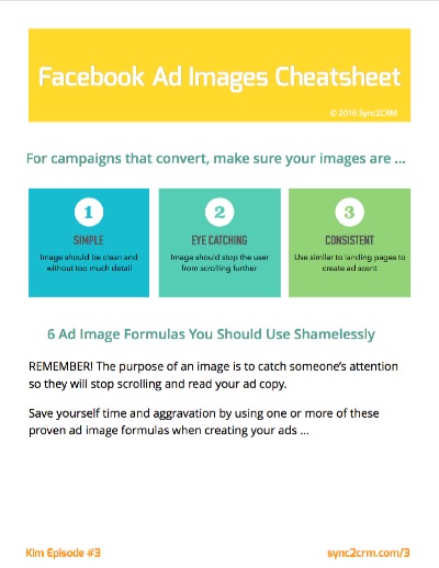
7:31 – Get the cheatsheet below for notes, action items and bonus material
8:37 – Conclusion is image text rules are more restrictive, not less
9:07 – Given that, here are my suggestions …
9:15 – Your goal is no warning tag on your ad for image text. Otherwise it’s dead.
9:47 – Use the old 20% text grids to get more text in without warning (maybe)
11:07 – Get my 20% image overlays for the most common ad sizes below to save you time
11:25 – Plan to test fitting text in 20% grid but then move around to see if it gets flagged
13:02 – That would be an improvement over old arbitrary grid
13:20 – What is your experience? Leave them in Facebook Group
13:50 – Join this broadcast live every Tuesday at Noon ET on Sync2CRM Facebook Page
Get The Cheatsheet and Action Items For This Episode
I think you will love this week’s cheatsheet. It includes two things I think you will find super useful:
- Facebook’s example images of what they consider OK, low, medium and high text on an image
- The links to Facebook’s image overlay tool and guidelines page
Plus two bonuses:
- My six formulas for ad images that stop people in their tracks and get them to read your copy
- A zip file containing the old 20% ad templates you can use while creating your images to save time
If you listened to the broadcast, you know why those are still useful even though the Facebook 20% Text Rule has “technically” gone away.
To download the cheatsheet (and bonuses), click the image below.
[thrive_2step id=’4357′] [/thrive_2step]


